


Branding + Web Design
Art Director
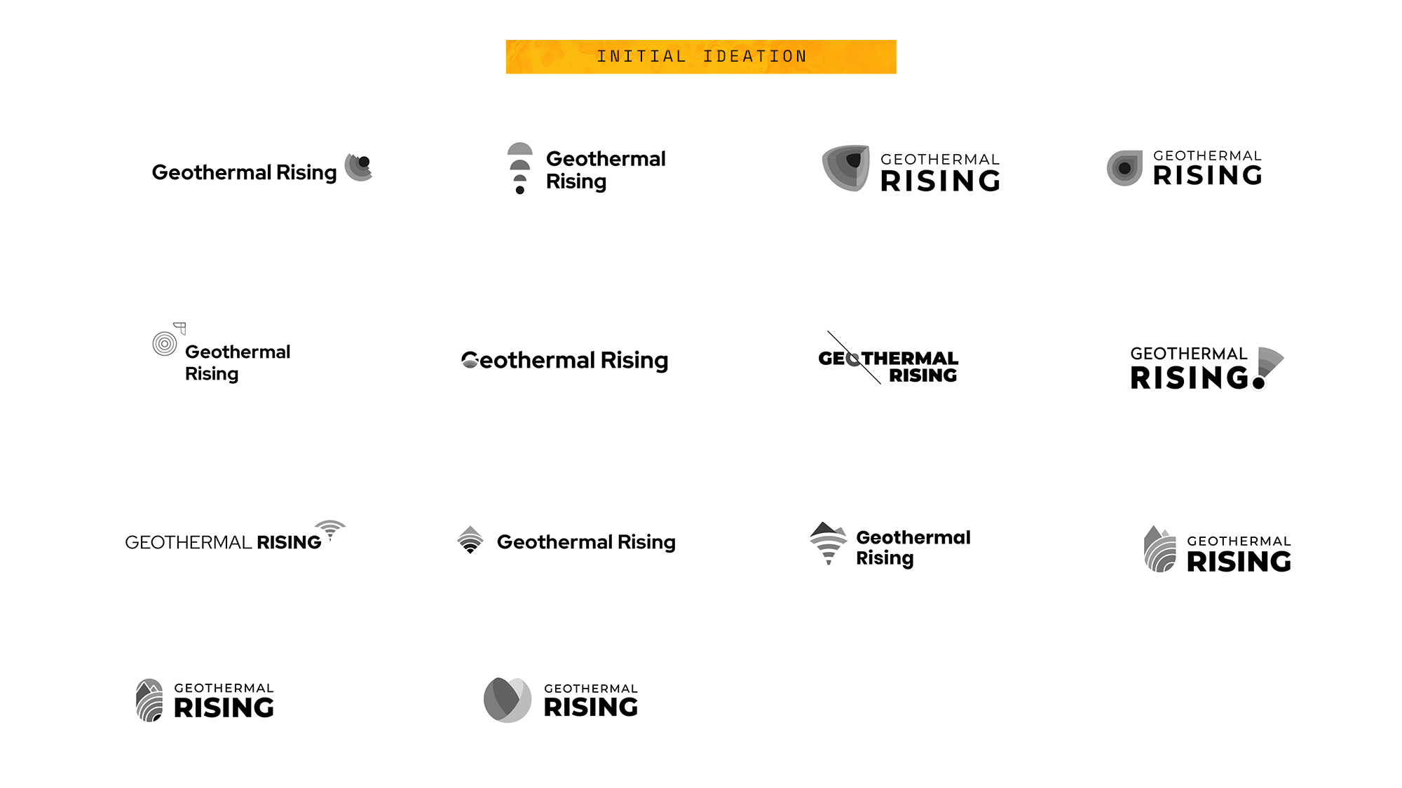
PART 01: A NEW NAME
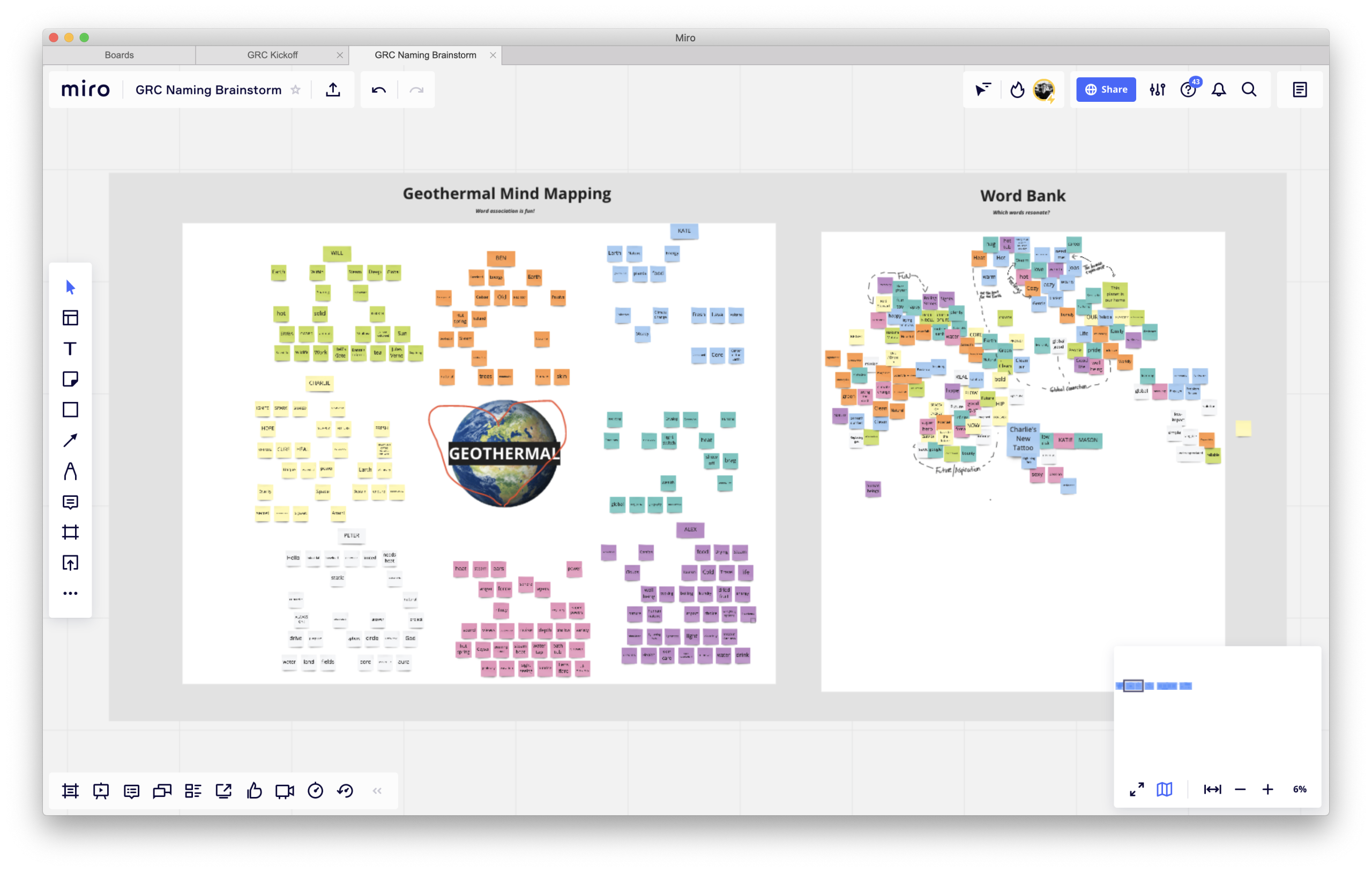
Using Miro, we conducted a fully virtual design-thinking workshop with the project’s key stakeholders to pick their brains and get them intimately involved with the renaming process. We ultimately pitched them several name options, and the board unanimously approved our favorite – Geothermal Rising. This name captures both the physical dynamics of how geothermal energy works, and the growing movement around this green energy source. Next stop: the logo.
PART 02: THE VISUAL BRAND
PART 03: BRAND GUIDELINES
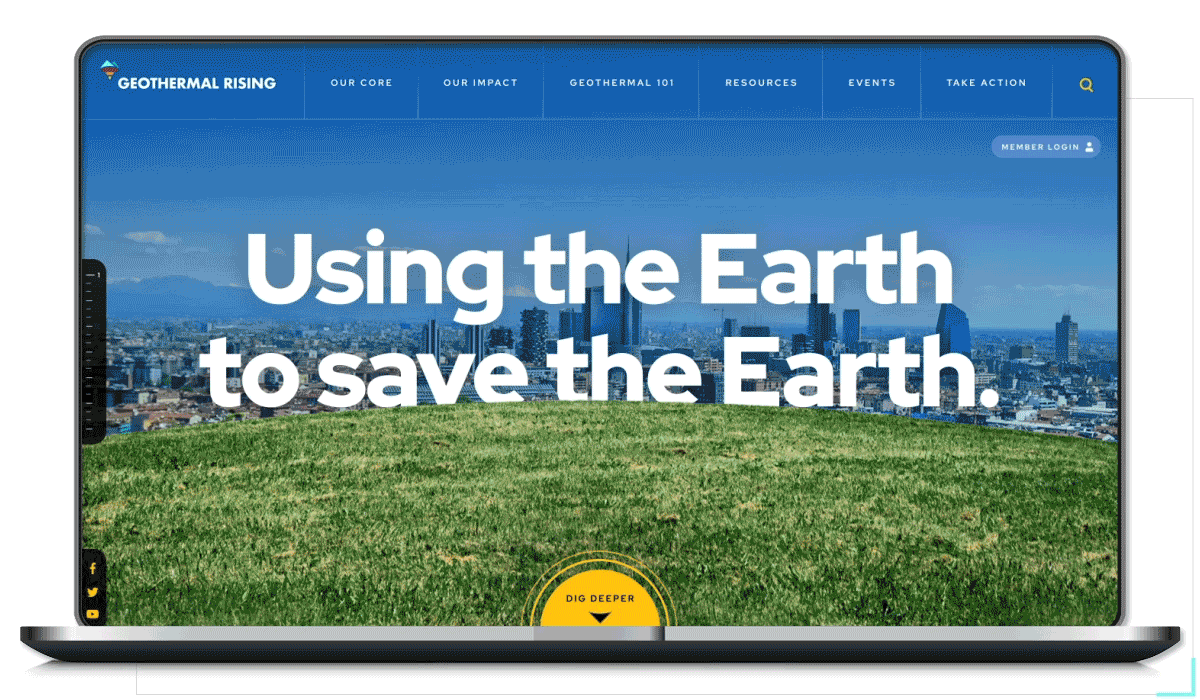
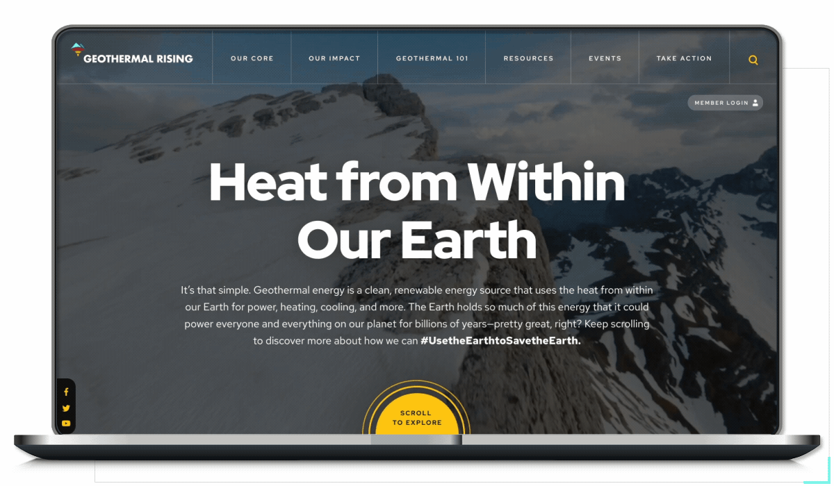
PART 03: WEBSITE REDESIGN
Our team also pitched adding a totally new section to the site; an immersive exerience designed explicitly for new audiences to learn the basics of geothermal energy. We used scroll-jacking to create the illusion of the user traveling through a landscape as they learn, creating the effect of a game.